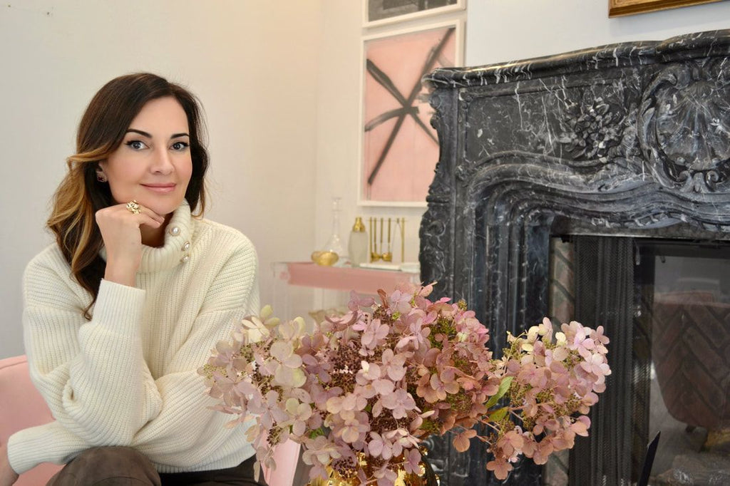
Interview with design expert - Nina Takesh
1. What determined your passion for design? Tell us about the moment you realized this is your way.
I grew up with parents who were attuned to design. My father was an architect who built some of Tehran’s most well-known residential high rises and other homes, and my mother’s design instincts were always spot on and I learned a lot from her. She carefully curated our homes in Montreux, the South of France and Beverly Hills with the finest in modern Italian décor, dressed us as little fashion plates and herself as a model on the cover of Vogue. (I cannot tell you how many hours we spent in the 1970s and 1980s in Celine and Chloe and Lanvin and Courreges watching her try on and discard every outfit until she found the perfect one.) She taught me how to arrange display items on shelves, how to spot an interesting piece amid a sea of rubbish and the orderliness that must underlie all good design. She instilled in me the importance of effective lighting, bed linens, tabletop items and art – but mostly in the clean, simple but luxurious esthetic I tend to work in. (I still have the exquisite antique art piece featuring a dragon from India that my mother once had hanging on the wall of her dining room in Beverly Hills.)

2. What inspires you?
Anything and everything. The line of a dress, a beautiful floor, the color of watermelon, the shape of a vase, a brand new counter material, a fluted column on a post-modern building.Travel, which exposes you to new cultures and people, expands my visual diary well so I do try to do a lot of that. The colors and organic forms of nature can inspire me along with interesting textiles and textures, both of which spark my imagination. And I am endlessly inspired by the little gems I seem to stumble onto in antique stores and at estate sales. Items from decades ago offer unique old typography, illustrations and design and can be worked in with more contemporary items for an eclectic and interesting look. I found two artworks by no one in particular at an estate sale a while back, but they were beautifully painted and in these wonderful ornate frames, so I hung them in my powder room.

3. If you had to choose 3 words to describe your personal style what would they be?
Clean-lined, bold, luxurious.
4. How do you combine beauty and function?
This is tricky because one tends to be drawn to beautiful design items and furniture that may not be functional or fit the mission of the house or room you’re designing. The first step is to figure out what the space is going to be used for. Is this an elegant place for social gatherings or a den that will be filled with kids?Each option will require very different layout and furniture design. I try always to start and stick with a functional layout knowing that in the future when a client wants to freshen things up a bit, he or she can just change accents instead of having to move walls and so on. And remember, a well-designed and functional house has major value on the re-sale market. A space must function and then you can dress it with style. That includes lighting. Lighting needs to be functional so the areas you need illumination have it, but it also needs to be designed in a way that provoke an emotional response.

5. In your view, how does art impact the home and workplace environment?
The idea that art is merely decorative is not true. Our environments have a major influence on how we experience the world, and on our emotional wellbeing, and through its contemplative and relaxing nature, art can be calming and even healing. A survey of 800 employees at 32 companies by the Business Committee for the Arts and the International Association for Professional Art Advisors found that art helps businesses with reducing employee stress, increasing creativity and encouraging employees to voice their opinions. And the School of Psychology at Exeter University found employees who have control over the design and layout of their workspacesare not only happier and healthier - they’re also up to 32% more productive. Art gives energy, stimulates the mind and feeds the soul.
In the home, art also has great benefits. It embellishes and dresses up what may have been an uninspired, antiseptic space, can spark a good mood, gives your home a personal character, and makes a space look finished in a way that bare walls never can. Art makes an impact.
6. What are some tips to consider when selecting art for the home?
Keep it personal. Only buy pieces that speak to your soul, whatever the reason. Do your research online but buy in person. Look at catalogs, go to galleries and art shows, haunt estate sales and eBay. Figure out what vibe you want in a particular room and then think about the room’s architectural features. If you have very high ceilings, you will need different artwork than if the room has low ceilings. Don’t forget color. Your artwork has to jive with the house’s palette as well as the kind of atmosphere you’re aiming to ignite, from neutral to dramatic. Same goes forlighting. Finally, keep your art away from light and make sure you choose a frame that’s complementary.

7. What is your favorite room of the house to design and why?
I actually like designing every room of the house because each room presents its own challenges, and I love that.
8. Is there a city that excites you, in terms of design?
I live in Los Angeles and it always inspires me. Its Mediterranean climate, free-spirited surfer vibe, and clean, unfussy ethos allow my mind to run wild. Los Angeles feels innovative. Where else, for example have you seen a circular painting? The look is light, airy, chic, cool and laidback, perfect for a sun-filled lifestyle. La design is a happy mix of contemporary, mid-century, modern and beach chic.
The other city that sparks my design mind is Paris, where the Parisians decorate their homes with effortless chic. There’s the whole idea of anti-décor, which is putting together pieces from eras that really don’t belong together. Portraits from the centuries ago with modern ones. The French blend colors and eras like contemporary, beige and white, clean-lined, boxy chairs and couches with Eero Saarinen’s Tulip chair designed between 1955 and 1956. They know that it is vintage and antique home wares that are the pieces that make the differencein a home, bringing a depth and detail it’s impossible to replicate. Parisians also like to create layered, luxurious classical interiors with a nod to Versailles using gilding, ornate frames and mirrored walls. They love patina on marble, metal, stone and wood, and do wonders in carved materials. They are great collectors and as a result, their shelves, bookcases and niches are full of precious items, books and curios that inspire me in my own design projects. I’m inspired by the antique stores on the left bank, and the flea markets, of course. Paris is a wonderful city for ideas.
9. What excites you most about Italian design?
Pretty much everything. The gorgeous colorful handmade pottery, exquisite artwork, linens and tableware are irresistible. The Italian design ethos is about minimalism, simple shapes that mesh with many other different styles. It’s also about true quality. Like the French, the Italians mix eras and materialsbeautifully. Their mosaic tile floors are beyond pretty and in almost every kitchen there is a glamorous marble countertop along with metal, wood accents in the furnishings.
10. What are brightening Décor Tips To Open Up Your Space
Clean the windows! It sounds silly but it helps. Lightening your paint job will also brighten the room up to no end. Put mirrors opposite windows to reflect more light and rearrange furniture if it’s blocking natural light. Edit your collectibles on shelves or tabletops. Too much is too much and the fewer knickknacks and clutter a room has, the brighter it seems. All these pieces take up room, light and visual space, so be judicious in choosing your accents. Use sheer curtains. And do away with heavy, dark furniture that can weigh down a room that isn’t bright to begin with. Choose lighter colors and natural materials for woods, upholstery and accents. If you have dark floors, change them out for blond planks, if you can. If not, cover the dark floors with white or ivory rugs, which will do double duty as anchors for your furniture setup. Add lighting where you need it and don’t hang too much artwork on your walls. Placing one piece of art on a wall with space around it makes the wall seem larger.


